Logo
Logo

Image

The Image element allows you to add and customize images in your design. It provides options to control the image’s source, size, alternative text, link properties, and advanced design features such as aspect ratio, filters, and visual effects. You can also manage the image’s responsiveness and lazy loading for performance and apply styles like borders, shadows, and spacing to integrate seamlessly with your layout. This element was introduced in Breakdance 2.1 and replaced the Image V1 element.

Utilizing the WordPress Media Library

The Image element utilizes the WordPress Media Library when you use it as your Image element’s source. Here are the primary enhancements that occur when using a Media Library image:

  • Alt tags from the Media Library are used automatically on the front end.
  • The Image’s size on the front end will be set automatically via the sizes attribute based on the Media Library Size selected in Breakdance.

Enhancing the Image Element

You can enhance the Image element and add additional features by placing the Image element within the appropriate Container element. Here are a few examples of how to take your Image elements to the next level.
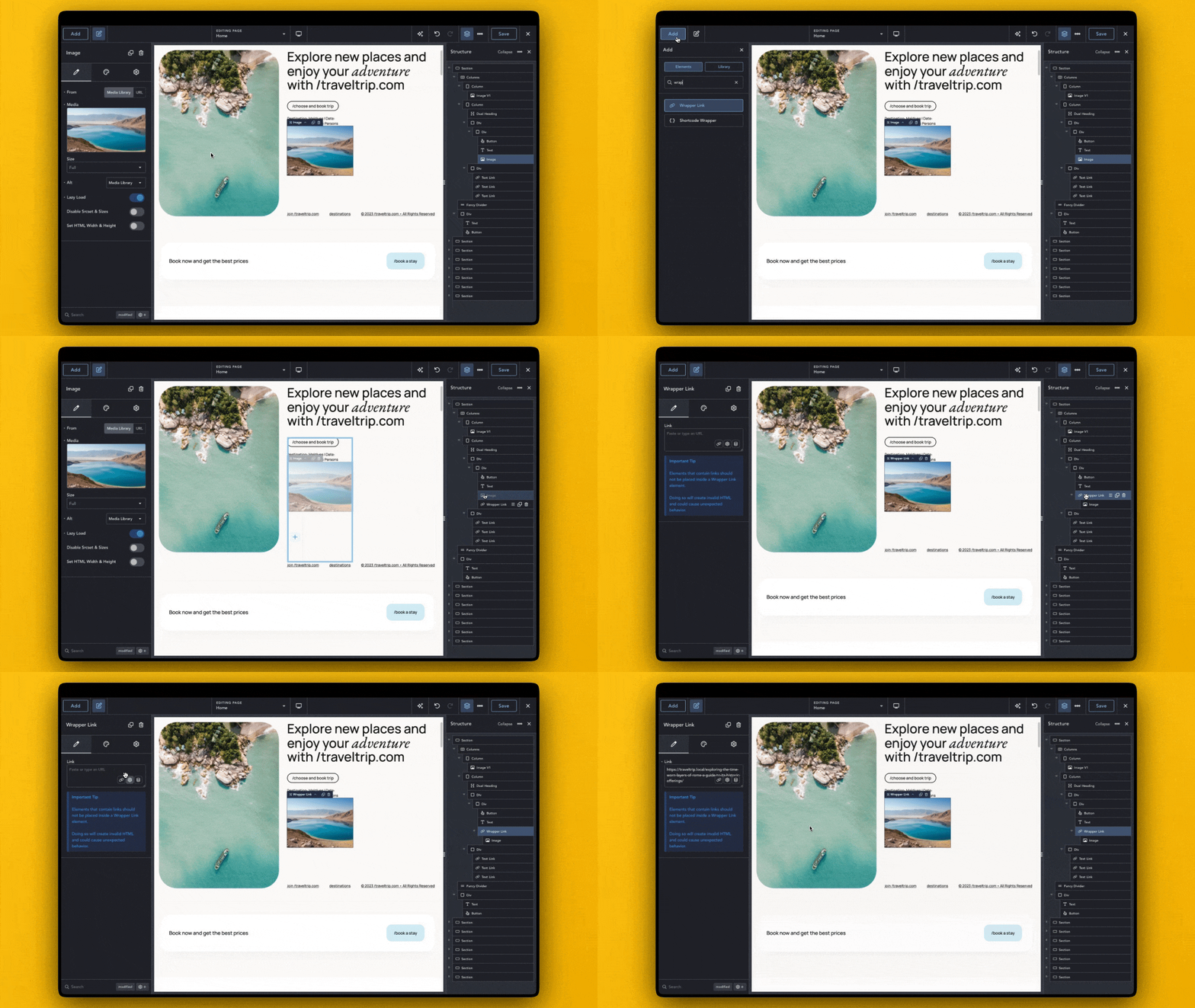
Adding Links to Image Elements

If you’d like to add a link to an Image element, place it inside a Wrapper Link element. You can then set the Link in the Wrapper Link element and continue to design your Image element as desired.
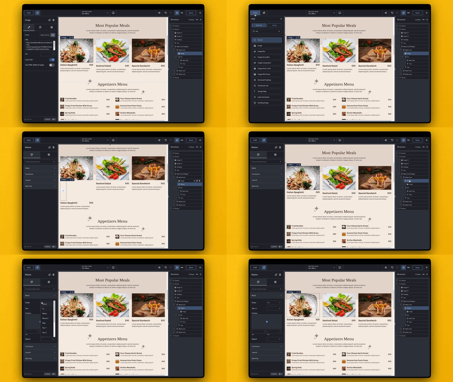
Adding Masks to Image Elements

By placing the Image element inside a Masker element, you can change the shape and feel of your Image.

Content Controls

The following controls allow you to configure the content and behavior of the Image element:

  • From – Choose the source of the image:
    • Media Library – Select an image from the WordPress Media Library.
    • URL – Enter a URL to display an image from an external source.
  • Media – Select an image from the Media Library. This option appears only when the source is set to ‘Media Library’.
  • Size – Select the size of the image. Available when an image is chosen from the Media Library.
  • URL – Enter the URL of the image to display. This option appears when the source is set to ‘URL’.
  • Alt – Set the alternative text for the image:
    • Media Library – Use the alt text from the WordPress Media Library. Available when the source is set to ‘Media Library’.
    • Custom – Provide a custom alt text for the image.
    • Decorative – Indicate that the image is decorative, so no alt text is needed.
  • Custom Alt – Provide a custom alt text. Only available when ‘Alt’ is set to ‘Custom’.
  • Lazy Load – Enable lazy loading to delay loading the image until it’s in the user’s viewport, improving performance.
  • Disable Srcset & Sizes – Disable WordPress’s automatic srcset and size attributes for the image.
  • Set HTML Width & Height – Enable this option to manually set the HTML width and height attributes for the image element.
  • Width – Set the image’s width. This option is available when ‘Set HTML Width & Height’ is enabled.
  • Height – Set the image’s height. This option is available when ‘Set HTML Width & Height’ is enabled.

Design Controls

Image

These controls allow you to adjust the image’s dimensions and how it fits within its container:

  • Width – Set a specific width for the image.
  • Max Width – Set the maximum width for the image.
  • Height – Set a specific height for the image.
  • Aspect Ratio – Select a predefined aspect ratio or create a custom one.
  • Custom Ratio – Set a custom aspect ratio by defining specific width and height. This option is available when ‘Aspect Ratio’ is set to ‘Custom’:
    • Width – Set the width for the custom aspect ratio.
    • Height – Set the height for the custom aspect ratio.
  • Object Fit – Determine how the image fits within its container. Available when ‘Height’ or ‘Aspect Ratio’ is set.

Effects

Apply visual effects to the image, such as filters, transitions, and blending modes:

  • Opacity – Adjust the image’s transparency.
  • Filters – Apply various visual effects:
    • Filter Items – Add one or more filter effects:
      • Type – Choose the type of filter, such as blur, brightness, contrast, etc.
      • Blur Amount – Adjust the blur intensity. Available when ‘Type’ is set to ‘blur’.
      • Amount – Set the level of the selected filter. Available for effects like brightness, contrast, grayscale, and more.
      • Rotate – Set the degree of hue rotation. Available when ‘Type’ is set to ‘hue-rotate’.
  • Transition Duration – Set the duration of transitions between filter effects.
  • Blend Mode – Control how the image blends with the background or other elements.

Borders

Customize the image’s borders, including radius, style, and shadow:

  • Radius – Set the border radius to control the corner curvature.
  • Styling – Adjust the border style, width, and color.
  • Shadow – Add shadow effects to the image for a sense of depth.

Spacing

Control the margins around the image for better layout integration:

  • Margin Top – Adjust the space above the image.
  • Margin Bottom – Adjust the space below the image.