
Element Settings
The Settings tab in Element Studio provides comprehensive configuration options for custom elements, allowing you to define their behavior, appearance, and integration within the Breakdance builder.
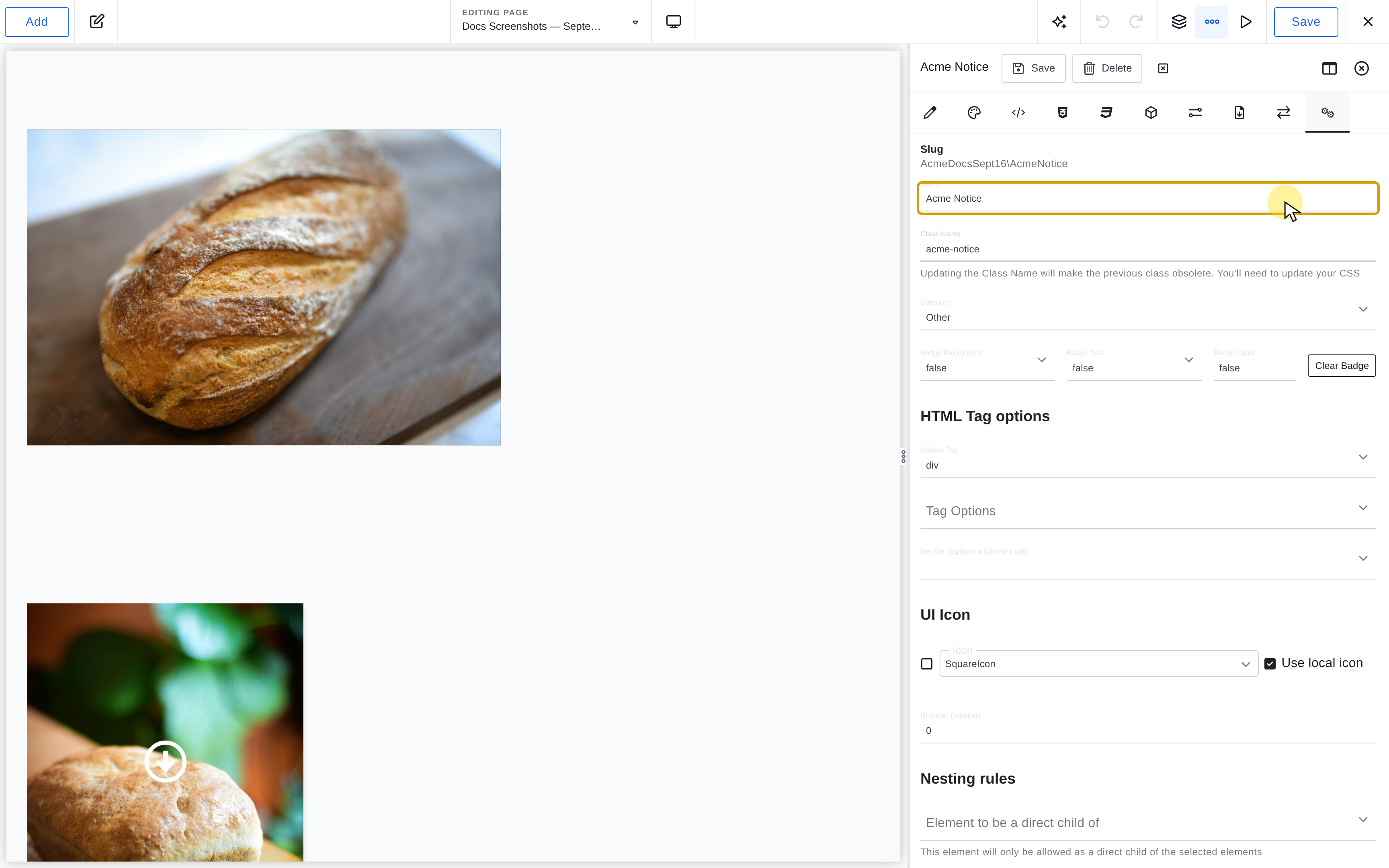
Basic Settings
Element Name
static function name()
{
    return 'My Custom Button';
}
The display name of your element in the builder interface.
- Must be unique within your namespace
- Cannot contain special characters
- Should be descriptive and user-friendly
Slug
static function slug()
{
    return __CLASS__;
}
The unique identifier for your element, automatically generated from the name and saving-location namespace. Changing Name exposes Update slug when a slug update is available.
- Auto-generated from the element name
- Can be manually updated when the name changes
- Used for PHP class names and file organization
Changing the slug: Changing the slug will break all existing instances of this element on your site. The element will no longer be recognized by Breakdance, and you’ll need to replace all instances with the new element or restore the original slug.
Class Name
static function className()
{
    return 'bde-my-custom-button';
}
The CSS class name for your element.
- Changing the class name makes the previous class obsolete
- You’ll need to update any existing CSS that references the old class
Category
static function category()
{
    return 'basic'; // Use a registered category slug.
}
The registered category where your element appears in the Add panel. Use the category slug, such as basic, rather than its display label.
Badge Settings
static function badge()
{
    return [
        'backgroundColor' => '#000000', // Background color
        'textColor' => '#ffffff',        // Text color
        'label' => 'New'                       // Badge text
    ];
}
Badges provide visual indicators for your element in the builder interface, helping users identify special or important elements.
- Badge Background Color: Select a background color for the badge. There is a predefined list of colors available.
- Badge Text Color: Select a text color for the badge. There is a predefined list of colors available.
- Badge Label: Add the label (text) for the badge. Set to false to not include a badge.
No Badge and Clearing Badges
static function badge()
{
return false;
}
To remove a badge, click the clear badge option, which will return false:
HTML Tag Settings
Default Tag
static function tag()
{
    return 'div';
}
The primary HTML tag for your element.
Tag Options
static function tagOptions()
{
    return ['div', 'section', 'article', 'aside'];
}
A list of alternative tags users can choose from in the builder.
Dynamic Tag Control
static function tagControlPath()
{
    return 'content.settings.html_tag';
}
Path to a control that determines the tag dynamically.
Note: When using a dynamic control, the Settings > Html > Tag control is automatically disabled.
UI Icon Settings
UI Icon
static function uiIcon()
{
    return 'SquareIcon'; // Using built-in icon
    // OR
    return '<svg>...</svg>'; // Using custom SVG
}
The icon displayed for your element in the builder interface. There are many built-in Icons available. You can also use a custom SVG Icon by toggling the Local control to “Off” and pasting the SVG Icon’s code.
UI Order
static function order()
{
    return 50; // Lower numbers appear first
}
The numerical order for displaying elements in the builder.
Nesting Rules Settings
Nesting rules define how your element can be placed within the page structure.
Direct Child Restrictions
static function nestingRule()
{
    return [
        'type' => 'final',
        'restrictedToBeADirectChildOf' => [
            'EssentialElements\Div',
            'EssentialElements\Section'
        ]
    ];
}
Elements that must be direct parents of your element.
Descendant Restrictions
static function nestingRule()
{
    return [
        'type' => 'final',
        'restrictedToBeADescendantOf' => [
            'EssentialElements\Div',
            'EssentialElements\Section'
        ]
    ];
}
Elements that your element can be placed inside.
Exclusion Rules
static function nestingRule()
{
    return [
        'type' => 'final',
        'notAllowedWhenNodeTypeIsPresentInTree' => [
            'EssentialElements\AnotherElement'
        ]
    ];
}
Elements that prevent your element from being used.
Inline Editable
static function nestingRule()
{
    return [
        'type' => 'final',
        'inlineEditable' => true,
        'inlineEditableBlockPath' => 'content.settings.global_block'
    ];
}
Enable inline editing for Global Blocks.
- Inline Editable: Select whether or not the element allows for Global Blocks to be edited inline.
- Inline Editable Block Path: Select the Control(s) that contain the Global Block(s) you want to allow for inline editing.
Element Type
static function nestingRule()
{
    return [
        'type' => 'final'
    ];
}
The type of nesting rule for your element. The default is final, and we recommend leaving it at this unless you are creating a more complex element.
| Type | Placement and children |
|---|---|
final |
No children; the default. |
final-link |
Childless link, excluded from link containers. |
container |
Accepts children other than sections. |
container-link |
Container link; excludes nested links. |
container-restricted |
Accepts elements registered as its direct children. |
container-excluding-self |
Container that cannot contain another of its own type. |
section |
Container allowed directly under the page root. |
final-that-is-allowed-inside-root |
Childless element also allowed at the page root. |
container-that-is-allowed-inside-root |
Container also allowed at the page root. |
popup |
Root-level placement for popup documents. |
root |
Internal tree root; not a type to choose for a custom element. |
Misc Options
Required Plugins
static function settings()
{
    return [
        'requiredPlugins' => ['woocommerce']
    ];
}
Plugins that must be active for your element to work.
Pro Only
static function settings()
{
    return [
        'proOnly' => true
    ];
}
Is Pro Only writes the element's proOnly flag. This is a built-in availability flag, not a licensing system for your extension.
Global Scripts Dependency
static function settings()
{
    return [
        'dependsOnGlobalScripts' => true
    ];
}
Indicate that your element depends on global scripts.
Experimental Element
static function experimental()
{
    return true;
}
Mark your element as experimental. These elements are only available to users who enable experimental elements via Preferences.
Bypass Pointer Events
static function settings()
{
    return [
        'bypassPointerEvents' => true
    ];
}
Enable Bypass Pointer Events when clicking content inside the element prevents the builder from selecting the element itself.
Disable AI
static function settings()
{
    return [
        'disableAI' => true
    ];
}
Disable AI Writing Assistant features for your element.
Share Props with SSR Children
static function settings()
{
    return [
        'sharePropsWithSSRChildren' => true
    ];
}
Share properties from this element with child elements via Server-Side Rendering.
Disable Wrapper HTML Tag
static function settings()
{
    return [
        'disableWrapperHtmlTag' => true
    ];
}
Remove the wrapper HTML tag (frontend-only).
Warning: This breaks JavaScript functionality that relies on the tag being present (e.g., .bde-themeless-template-content-area-256146-124).
Builder Only
static function settings()
{
    return [
        'builderOnly' => true
    ];
}
Element visible only in the builder.
Add Panel Rules
Always Hide
static function addPanelRules()
{
    return [
        'alwaysHide' => true
    ];
}
Hide element from the Add Panel completely.
Allowed Post Types
static function addPanelRules()
{
    return [
        'allowedPostTypes' => ['breakdance_template']
    ];
}
Restrict element to specific post types.
Default Properties
static function defaultProperties()
{
    return [
        'content' => [
            'text' => 'Default text',
            'settings' => [
                'alignment' => 'center'
            ]
        ],
        'design' => [
            'typography' => [
                'font_size' => '16px'
            ]
        ]
    ];
}
Set default values for your element’s properties. This can be set manually, or by adding an element to a design, opening Element Studio, and selecting an instance of the same element, and clicking Import under Default Properties. Current Default Properties shows the stored values.
Available In
static function availableIn()
{
    return ['breakdance', 'oxygen'];
}
Specify which builder modes your element is available in.
Options:
- breakdance – Breakdance builder
- oxygen – Oxygen builder