
June 24, 2025
Breakdance 2.5 is here, packed with powerful tools to supercharge your web design workflow. This release brings a suite of innovative features that make building stunning, dynamic websites faster, more intuitive, and more engaging than ever. From inline editing for Global Blocks to mesmerizing scroll animations and form enhancements, Breakdance 2.5 empowers you to create with unmatched creativity and efficiency
Existing users can start beta testing today. Continue reading to discover everything included in Breakdance 2.5.

Editing Global Blocks just got a whole lot smoother. Now you can edit any Global Block directly in the builder. Update text, swap an image, tweak padding, or add new elements, any edits you make will be instant.
Inline Global Block editing eliminate extra clicks, keeps you focused on your design, and saves you valuable time. The result is cleaner, more consistent sites and a workflow that feels seamless.
When using this alongside the ability to create new Global Blocks from the Quick Navigator, you don’t ever have to leave your current design when building it out for the first time.
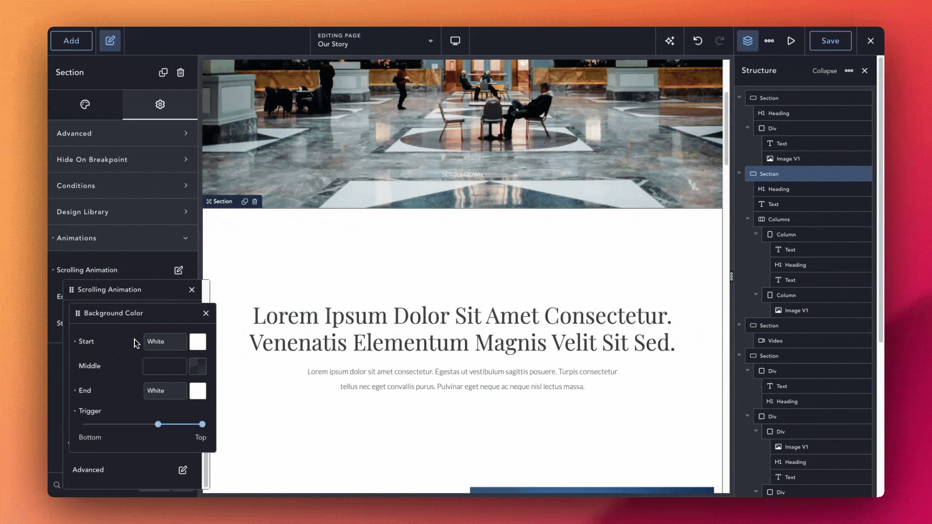
We’re thrilled to introduce a major enhancement to our scrolling animations: you can now animate background and text colors as users scroll through your pages. This means you’re no longer limited to movement-based animations — now, you can design immersive experiences where the mood, tone, and style of your content evolves with every scroll.
Make sections that gradually shift from light to dark as the user dives deeper, headlines that subtly change color to guide attention, or full-page transitions that create stunning visual storytelling. With this new feature, it’s easier than ever to design rich, interactive narratives and high-impact visual journeys — all without writing a single line of code.
Whether you’re creating a landing page, portfolio, product showcase, or editorial layout, animated color transitions give you the tools to make your designs stand out. It’s smooth, intuitive, and completely customizable. Choose your colors, set your triggers, and let the animation engine handle the rest.
This upgrade is part of our commitment to giving you the most flexible, expressive, and creative design toolkit possible — and it’s just the beginning. Go ahead and start experimenting — your scroll has never looked this good.
Craft sections such as hero banners, CTAs, pricing tables, or custom layouts—and turn them into a personalized library of Design Library Parts that you can add to any page with just a few clicks. Once you save a part, dropping it into a new page lets you customize content locally without altering the original design. It’s a faster, more scalable way to build and maintain consistent layouts.
Using parts is simple: inside the builder, press Cmd/Ctrl + B to open the Design Library, switch to “This Website,” and you’ll see all your saved parts. Add the one you want to the page, then update your content, swap images, or adjust styles—the tweaks stay local to that page. A built-in filter makes it easy to find the perfect part, page, or design whenever you need it.
Create a fully branded hero banner once, save it as a part, and then drop it into every new project. Or build a pricing table template and reuse it across multiple landing pages—no rebuilding required. By keeping your best layouts in one place, you stay organized, work efficiently, and bring projects to completion faster. Take it further by using a Design Set to store all your parts, so you can apply the same library across multiple sites. Build once, reuse everywhere, and watch your workflow transform.
We’ve made a variety of improvements to the Builder to streamline workflows and help you build faster and smarter.
Set your preferred unit—px, em, %, or rem—once in the Preferences menu, and watch Breakdance set the default unit everywhere. No more toggling between units as you adjust margins, padding, or font sizes. Once you pick a default, every control and global setting respects it automatically, letting you focus on the numbers.
This small preference saves you from repetitive clicks and keeps your measurements uniform across every element. Instead of pausing to switch units, you stay in the flow—whether you’re fine-tuning a header’s padding or scaling text for responsive layouts.
By choosing a default unit, you’ll spend more time on creativity. Everything feels cohesive, measurements stay consistent, and your workflow moves faster—day in, day out.

Now you can see inherited values for any property as you switch between desktop, tablet, and mobile views. This experimental feature, available in the preferences menu, means no more trial and error when fine-tuning layouts. For example, if you adjust padding on mobile and wonder whether it was inherited from the tablet settings, the builder will show you the value that’s being passed down. That clarity keeps your design consistent across devices and helps you avoid unintended overrides.
By revealing inherited values, you’ll work faster and with more confidence. Tweak a headline’s font size on tablet, switch to mobile, and instantly see the inherited size before making changes. This makes responsive edits precise, prevents surprises, and keeps your layout clean—ensuring every breakpoint looks exactly as you intend.
 Now you can generate a new design preset directly from the “Choose Design Preset” input box in the Properties Panel. Simply type your preset name and press Enter—no additional clicks or extra dialogs required. This small tweak speeds up the process of saving custom styles and keeps you focused on design rather than navigating menus.

Typography presets now show font-weight, font-size, font-style, and line-height directly in the chooser. This makes it easier to identify and select the exact style you need at a glance. Additionally, the Typography Preset input box now features autocomplete, so suggested presets appear as you type—saving time and ensuring consistency across your design.
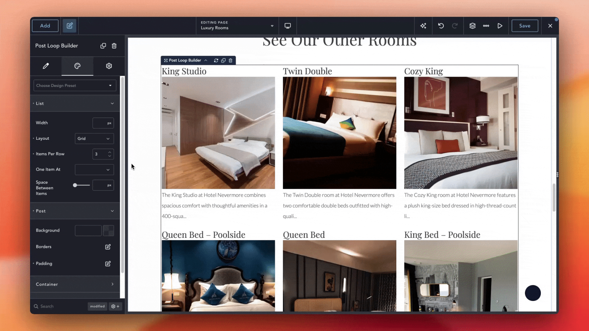
Loop Elements now support Masonry layouts, letting your content automatically flow into a staggered grid without any custom code. Whether you’re displaying blog posts, portfolios, product listings, or image galleries, your items will align in a visually engaging way—each item fits together seamlessly, avoiding awkward gaps and creating a dynamic presentation.
Showcase a portfolio where each project card shifts into place like puzzle pieces, or presenting a product catalog that feels organic and modern. Simply add a Loop Element, select the Masonry layout, and watch Breakdance arrange your items into an attractive, responsive grid. It adapts automatically as you add or remove items, so new content snaps into place without extra adjustments.
This feature cuts out the need for manual CSS and plugin workarounds. Set your column count or let Breakdance determine the best fit, and let the grid handle varying item heights and widths. The result is a polished, professional layout that highlights your content naturally. With Masonry support, you’ll spend less time tweaking styles and more time creating—your pages look great on any device, and your audience gets a seamless browsing experience every time.
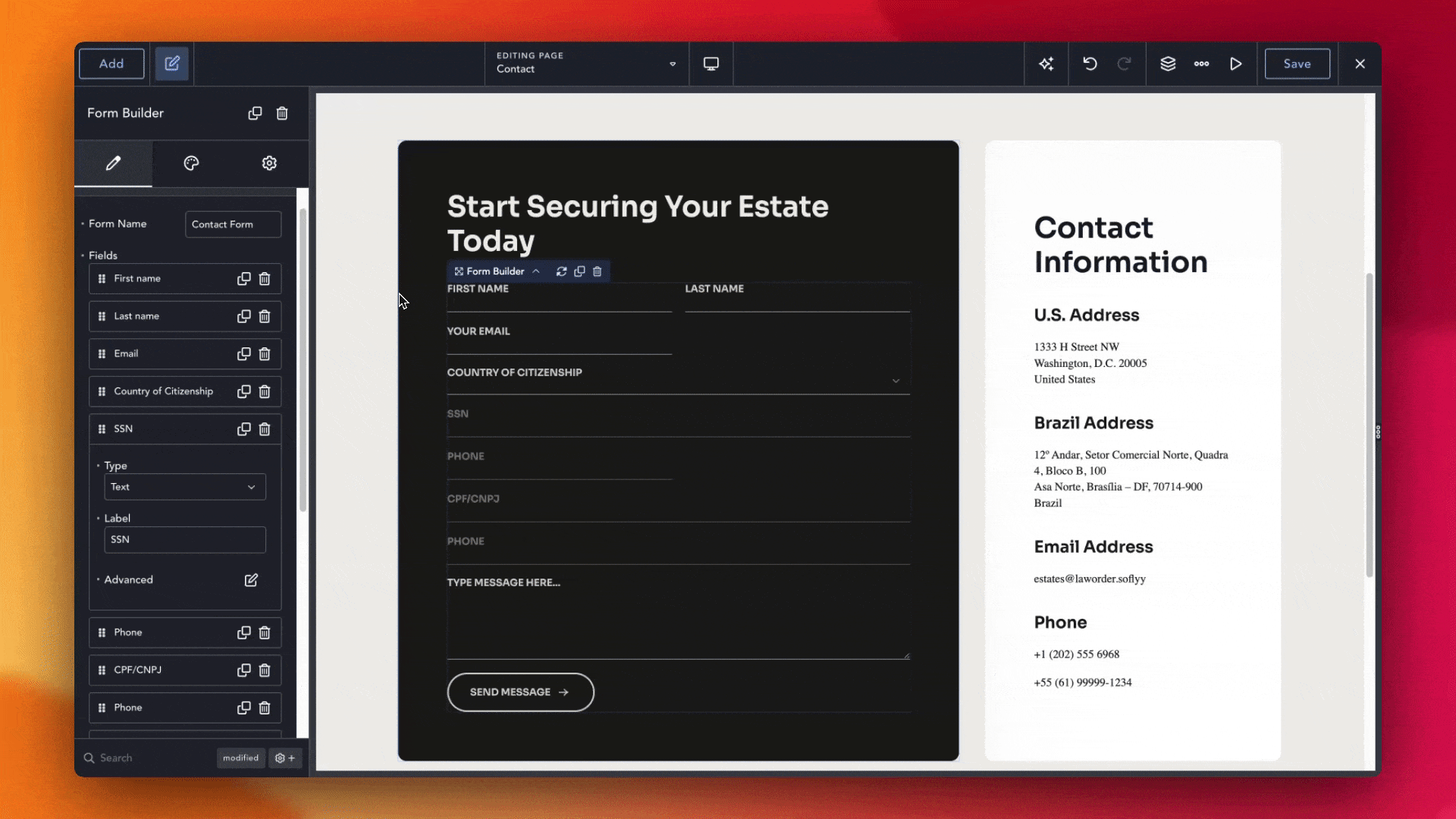
Now you can guide visitors to enter information exactly as you need it. With Input Masks on text fields, forms automatically format user input as they type. This means fewer validation errors, faster submissions, and a smoother experience for everyone.
By defining the mask ahead of time, you reduce mistakes and speed up form completion. Whether you need phone numbers, dates, social-security formats, or any custom pattern, simply create the mask, and let the form handle the rest.
With Input Masks in place, your forms feel professional and effortless. Visitors never have to wonder, “How should I enter this?” They type once, and the mask formats their input automatically. It’s a small change that can boost conversions, prevent validation headaches, and keep your forms running flawlessly.
Get maximum flexibility with unlimited licensing and domain activations.
Get your money back within 60 days of purchase, no questions asked. It's risk-free!
We offer premium support to ensure the ultimate customer experience.
For a limited time, we're offering an unlimited site license for just $199.99/year. Buy now to lock in this price.